Why Landscaping Websites Fail to Get Leads (5 Ways)
Landscaping website conversion fails when a site acts as a passive business card rather than a proactive sales tool. Common culprits include slow loading speeds, poor mobile optimization, hidden contact information, and a lack of high-quality project photos that prove your expertise to potential local clients.
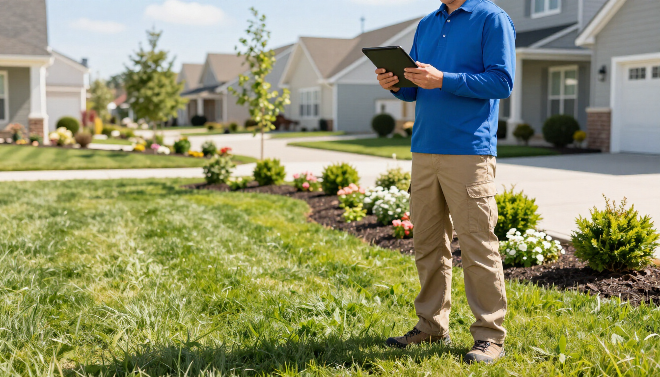
You work hard. You’re out there in the heat, transforming overgrown yards into neighborhood masterpieces, managing crews, and ensuring every retaining wall is perfectly level. But when you get home and check your email, the inbox is empty. No new quote requests. No 'thank you' notes from prospects who saw your site. It’s frustrating because you know you’re the best at what you do, but your digital presence isn't reflecting that.
Many landscapers treat their website like an afterthought—a box to check off once and then forget about. But in today's market, your website is often the first 'crew member' a client meets. If that crew member is slow, messy, and hard to talk to, the client is going to find someone else. At Lawn Lead, I’ve seen this play out dozens of times, and the good news is that these issues are fixable.
What makes a landscaping website fail to convert?
If you have traffic coming to your site but no one is clicking the 'Get a Quote' button, you have a landscaping website conversion problem. The most common reason a site fails to convert is a lack of clarity. When a homeowner lands on your page, they usually have three questions they need answered in less than five seconds:
- Do you service my specific area?
- Do you offer the specific service I need (mowing, hardscaping, irrigation)?
- Can I trust you to do a good job?
If your website is cluttered with technical jargon or outdated design elements, the visitor won't stick around to find those answers. They’ll bounce back to Google and click on the next competitor. Another major issue is 'choice paralysis.' If your homepage lists 50 different services without a clear hierarchy, people get overwhelmed. They don't want to dig through a messy list; they want to see that you are an expert who can solve their specific problem. Your site should guide them like a well-manicured garden path, leading them directly to the final destination: the contact form.
Common Technical Errors Killing Your Landscaping Leads
Beyond the visuals, there are 'silent killers' that stop customers from ever reaching out. The biggest one is speed. We live in an era of instant gratification. If your website takes more than three seconds to load, you’ve likely lost 40% of your potential leads. High-resolution photos are essential for landscapers, but if they aren't optimized, they act like lead weights on your site’s performance.
Technical errors often include:
- Unsecured 'Not Secure' warnings in the browser bar due to lack of SSL.
- Broken links that lead to 404 pages instead of your Services page.
- Large, uncompressed image files that bloat page size.
- Missing local SEO metadata, making it impossible for local clients to find you.
- Forms that don't actually send emails to your inbox when submitted.
Another technical hurdle is SEO. If your site isn't structured to tell Google that you are a landscaper in a specific city, you won't show up in the 'Map Pack.' You can check out my Pricing & Process to see how I integrate these technical fixes into every build. Without a solid technical foundation, the most beautiful design in the world won't get seen by the people who matter most.
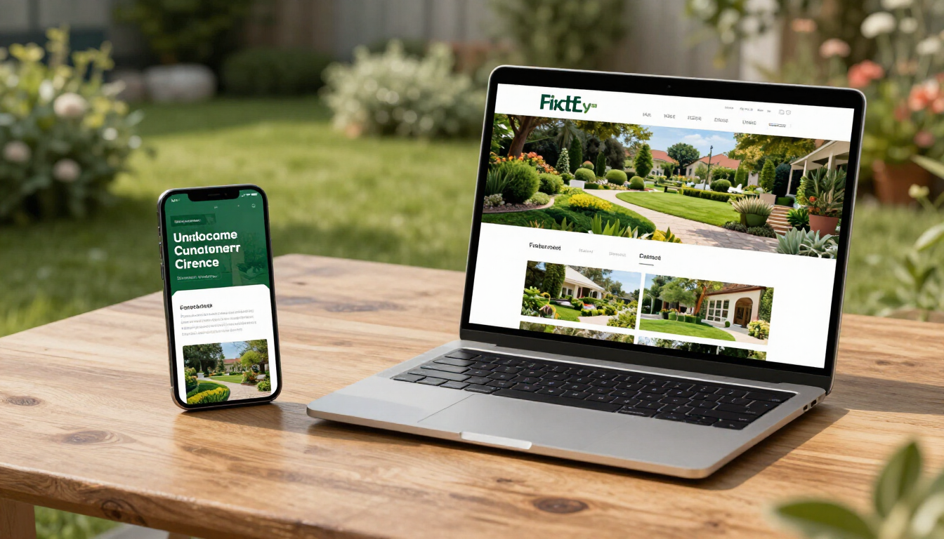
Does your mobile experience drive customers away?
Think about your typical customer. They’re likely sitting on their couch at 8:00 PM, scrolling through their phone, looking for someone to fix their drainage issues or install a new patio. If your website is designed only for a desktop computer, it’s going to look like a jumbled mess on their screen. Buttons will be too small to click, text will be microscopic, and your phone number might not even be 'click-to-call.'
A 'mobile-friendly' site isn't just about things fitting on the screen; it's about the thumb experience. Is the 'Request a Quote' button easy to hit with a thumb? Can they see your Work & Results without having to zoom in and out? Google also prioritizes mobile-first indexing, meaning if your mobile site is poor, your rankings will suffer across the board. If you haven't checked your site on your own phone recently, do it now. If it’s frustrating for you, it’s definitely frustrating for your customers.
The Power of Visual Proof in Landscaping
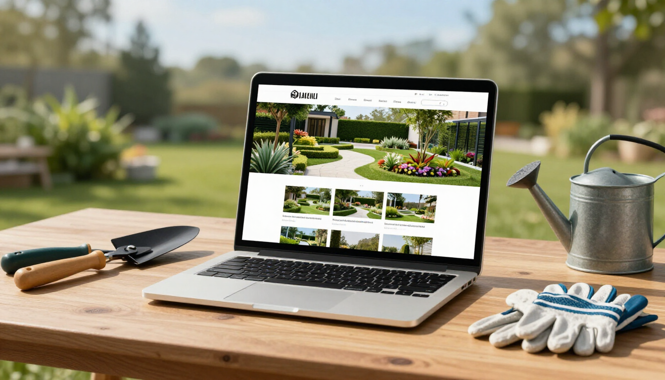
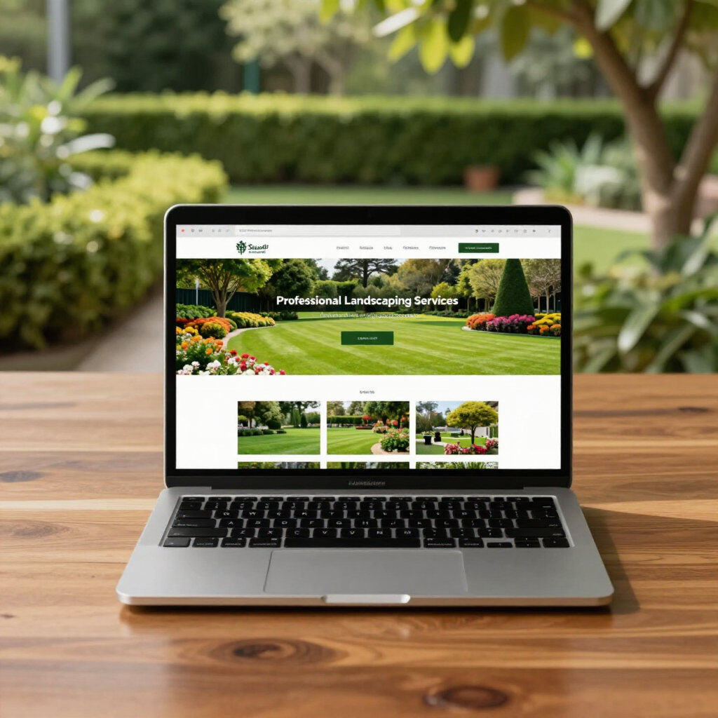
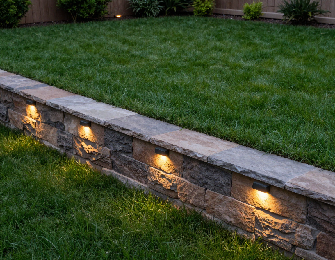
In the green industry, seeing is believing. You can tell a customer that you’re the best hardscaper in the county, but until they see a crisp, high-quality photo of a paver patio you installed, they’re going to be skeptical. One of the biggest reasons landscaping websites fail is a lack of visual proof—or worse, the use of low-quality, blurry, or stock photos.
Stock photos are a conversion killer. People can tell when a photo isn't yours. They want to see your trucks, your crew, and the actual yards in their neighborhood that you’ve transformed. Your project gallery shouldn't just be a dump of images; it should tell a story of transformation. High-quality imagery builds immediate trust and sets a benchmark for the quality of work the client can expect.
How can a better call-to-action increase quote requests?
A 'Call-to-Action' (CTA) is the instruction you give your visitor. Many landscaping sites have weak CTAs like 'Contact Us' buried at the very bottom of the page. Or, they have no CTA at all, assuming the visitor will just find the contact page on their own. This is a mistake. You need to be direct and make it as easy as possible for them to take the next step.
Effective CTAs for landscapers include:
- 'Get My Free Quote Today'
- 'Schedule a Property Consultation'
- 'Start My Project Design'
- 'See Our Recent Work'
- 'Call Now for a Drainage Assessment'
You should have a clear, high-contrast button in the top right corner of every page and at the end of every section. Don't make people think about what to do next. Tell them. If you want more tips on this, feel free to browse the Lawn Lead Blog . A well-placed CTA can be the difference between a 'looker' and a 'booker.'
Why your website should be a lead-gen tool, not a business card
An online business card is static. It’s a digital placeholder that says, 'I exist.' A lead-generation tool, however, is dynamic. It works for you 24/7. It qualifies leads by asking the right questions in the contact form, it educates customers about your process, and it builds a brand that commands higher prices.
When you work with me, we don't just build a 'pretty' site. We build a system designed to grow your business. You can learn more About Alex and why I focuses specifically on the landscaping niche. Your website should be an investment that pays for itself through the new contracts it brings in, not a monthly expense that does nothing but sit there. It’s time to stop letting potential customers slip through the cracks of a failing website.
Summary of How to Fix Your Landscaping Website
Transforming your site from a failing business card into a lead-generating machine requires a focus on user experience and trust. By addressing the technical issues, optimizing for mobile, and showcasing your best work with clear calls-to-action, you can significantly increase your conversion rates and grow your landscaping business.
- Optimize Speed : Ensure your site loads in under 3 seconds to keep visitors engaged.
- Prioritize Mobile : Design for the 'thumb experience' first to capture evening scrollers.
- Show Real Work : Use high-quality, original photos of your actual projects to build trust.
- Be Direct : Use clear, high-contrast CTA buttons to guide users to your contact form.
- Clarify Services : Ensure visitors know exactly what you do and where you do it immediately.
If you're ready to stop losing leads and start winning more jobs, Get a Free Quote for a new, conversion-focused website today.
Recent Posts